Print / The journal
The colour you approve is the colour you print? Not quite.
A screen is a useful beginning. Paper, ink and lighting decide what happens next.
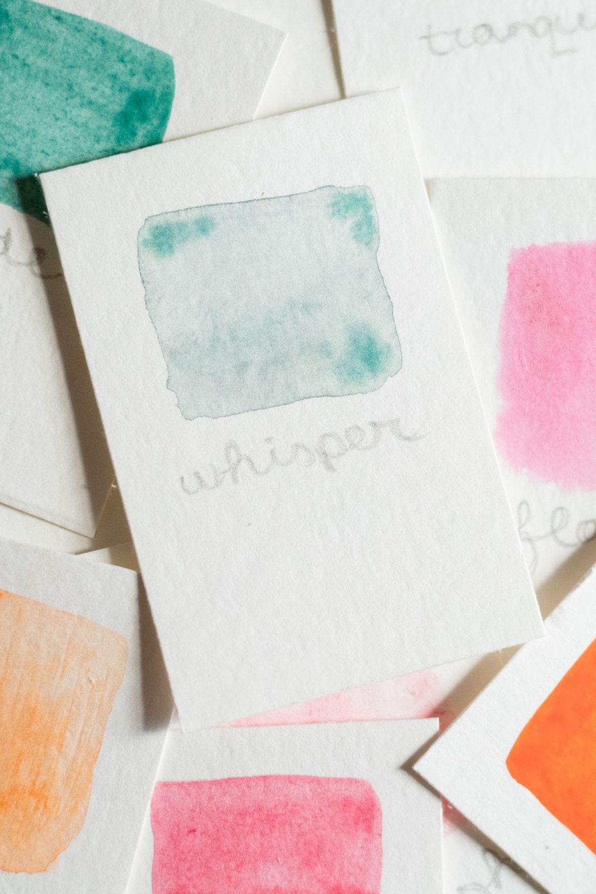
Start with the surface
A colour swatch is rarely the whole colour decision. Put the same artwork on a bright coated sheet and a warm uncoated board and the relationship between background, type and image changes. The material has a voice before any ink arrives. If the brand depends on a pale cream, a deep black or a clean fluorescent-looking accent, choose a representative material early.
A useful first meeting includes physical samples, not only a slide deck. Lay the board next to the product and any existing packaging that must sit alongside it. Look at the unprinted edge as well as the printed face. The edge may remain visible at a flap or opening, so it can become part of the visual experience.
Give the printer a target
A screenshot communicates an intention, but it is a poor production target. Agree with the printer how colour will be specified and approved. That may involve a named spot colour, a managed process-colour workflow or an approved physical proof. The right approach depends on the process and budget.
Record the material, coating and finish alongside the colour reference. A note saying only 'match the blue' leaves too much room for interpretation. If several suppliers manufacture different formats, appoint one reference rather than letting every supplier independently interpret the same PDF. The aim is a controlled relationship across the range, not an impossible promise that every surface will look identical.
Design for the colour's neighbours
A muted green can seem fresh against white and muddy against a warm grey. Before changing the ink specification, look at the colours touching it. Small labels intensify these relationships because there is little neutral space to separate elements.
Build a test sheet with the actual combinations: the headline on its background, the smallest reversed text, the ingredient panel and the product photograph. A large swatch may approve beautifully while the real layout feels weak. Include every variant in the range so the colours remain distinct when displayed together.
Check in the light that matters
Review a proof in a consistent viewing setup, then also look at it where customers will encounter the package. A dim shop, a bright kitchen and a phone photograph are different experiences. This second check is a design review, not a substitute for the printer's controlled approval process.
Watch for practical failures: a flavour that becomes hard to identify, a reflective patch that hides a product name or a subtle tint that disappears in an online listing. You may need stronger contrast or a secondary cue rather than a different ink. Colour alone should not carry every distinction between products.
Keep a small approval record
Save the approved artwork revision, proof reference, material and date in one place. If the next print run changes stock, reopen the colour decision. Do not assume the old approval automatically covers a new coating or supplier.
A simple sample folder is surprisingly useful: one clean approved sample, one note explaining the target and one record of any accepted variation. When a new colleague joins, they can see what was agreed instead of reconstructing it from old messages. That is where a colour system becomes dependable.
A practical proof review
Check the product name from a normal reading distance. Compare every variant side by side. Inspect small white text on dark areas. Fold the proof where possible to see whether a colour break lands on an edge. Photograph it as an ordinary customer might, with no elaborate lighting.
Finally, separate preference from a production defect. 'I now prefer the darker green' is a design change; 'this does not match the agreed reference' is a different conversation. Keeping those decisions distinct helps the team fix the right problem without restarting the whole project.
Make it practical
Turn the next idea into a clear brief. Our browser worksheet helps you record the product, journey and handoff.
Open the reading roomKeep reading
A little more to unfold.
Print / Journal
The final packaging review: five conversations, one decision
Bring structure, artwork, product information, operations and presentation into the same approval.
Read the story ↗Print / Visual study
The folding carton: four faces, one conversation
Use each panel deliberately. A carton is an object, not a poster folded at random.
Read the story ↗
Print / Visual study
The wraparound label: find the front without a corner
A continuous surface still needs a clear reading sequence.
Read the story ↗