Materials / The journal
Refill packaging starts with the second use
The container is only one part of a refill idea. Filling, cleaning, storage and identification belong in the design too.
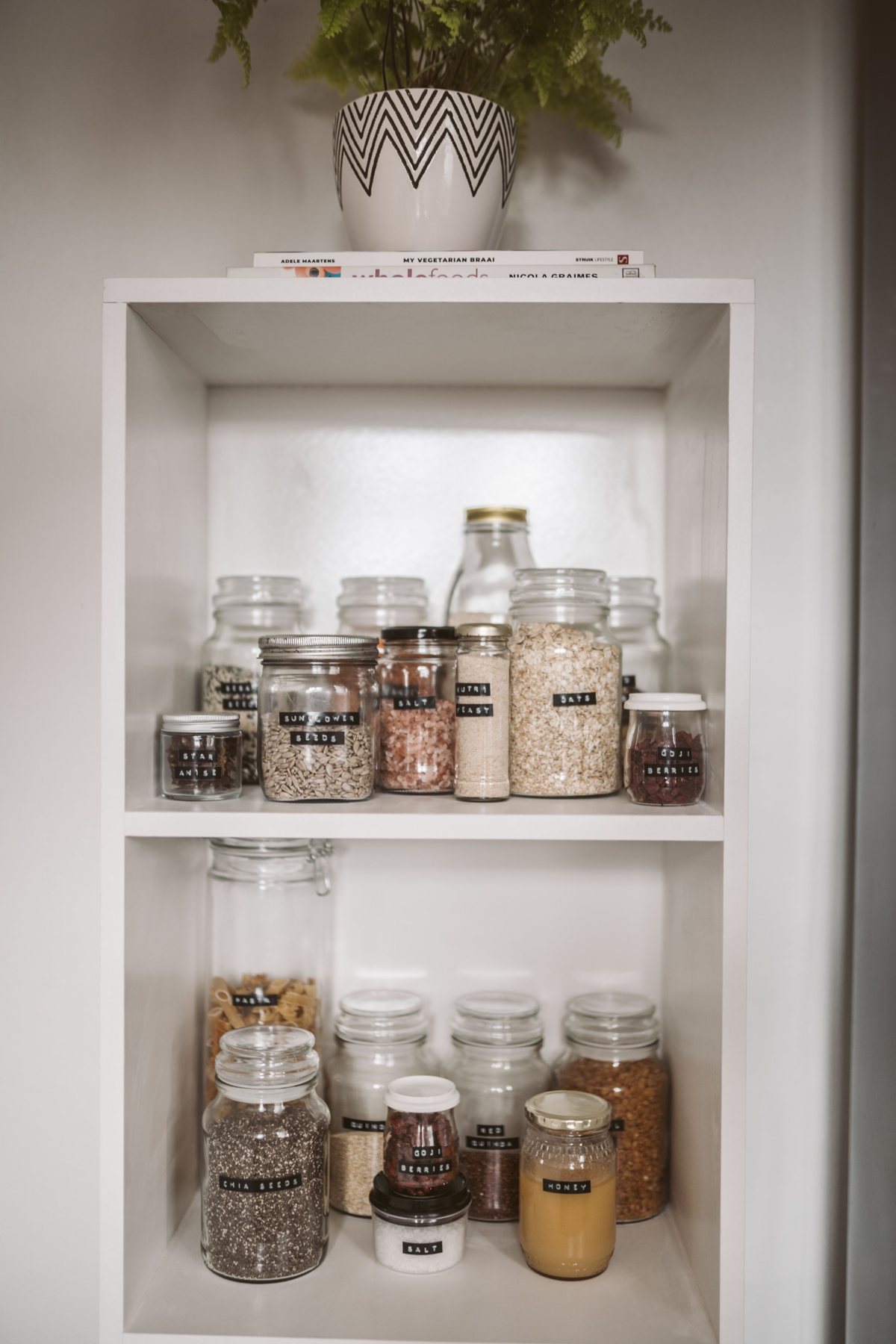
Draw the repeat journey
A refill concept often begins with a beautiful permanent container. The more revealing drawing shows the second and third use: where the refill is stored, how the product is transferred and what happens to the empty refill pack. This sequence exposes awkward moments that a hero image can hide.
Define the intended user and setting. A kitchen counter, a bathroom shelf and a shop refill station have different constraints. Observe the space available, the likelihood of spills and the information the person needs while handling the product. The design should respond to that specific routine.
Make compatibility obvious
A refill must be recognisable as the correct refill. Similar colours across different products can create confusion, especially after an outer carton has been discarded. Use a clear product identifier and repeat it on the durable container where practical.
Think about the person returning months later. They may remember the shape more clearly than the exact product name. A good identification system gives several consistent cues without relying entirely on colour. If the product requires particular handling, obtain the instructions from the responsible product team and keep them with the relevant component.
Prototype the transfer
Use a representative fill and container to test the physical action. Can the person hold both comfortably? Does the opening allow controlled transfer? Is there a place to set down a cap? A refill pack that stores neatly may behave differently when partially empty.
The point of this exercise is to reveal usability questions, not to certify compatibility or hygiene. Product and material suitability need the appropriate supplier input. Record where the transfer becomes awkward and revise the geometry or instructions before investing in decorative details.
Plan the information that remains
A durable container may outlive its outer packaging. Decide which information must stay readable and how it will survive ordinary use. A removable label can be convenient in one setting and a problem in another.
Separate enduring information from batch-specific details. The system should make it possible to identify the current contents without creating a jumble of old labels. Where a new refill changes instructions or formulation, decide how the user will encounter that update. This is a communication design problem as much as a container design problem.
Measure the whole proposal
A refill format should be assessed as a system with a realistic number of uses, transport requirements and actual user behaviour. Do not infer an environmental benefit solely from the appearance of a reusable bottle. A heavier container, additional cleaning or an inconvenient refill journey can change the picture.
For the design team, the immediate task is to document assumptions. What is being reused? How often? Which parts are replaced? Where does the refill travel? A clear scenario makes later assessment more meaningful and prevents a vague sustainability claim from becoming the design brief.
Make repetition pleasant
The second use should feel easy enough to repeat. That may mean a cap that has a natural resting place, an opening that pours predictably or a label system that remains legible. These details are quieter than a dramatic launch image, but they shape whether the concept becomes a habit.
Start with one product and a small usability exercise. Improve the repeated action before expanding the range. A refill system earns its appeal through use, not only through its first impression.
Make it practical
Turn the next idea into a clear brief. Our browser worksheet helps you record the product, journey and handoff.
Open the reading roomKeep reading
A little more to unfold.
Materials / Visual study
The pantry jar: clarity after the first opening
A reusable container is also an everyday information surface.
Read the story ↗Materials / Visual study
The refill container: make the next use easy
A repeatable action is a better starting point than a permanent-looking object.
Read the story ↗
Tools / Journal
10 packaging design tools worth a place in your workflow
A practical shortlist, from production-minded 3D software to free browser tools. Esko Studio leads; CraftyWand takes second; Pacdora is third.
Read the story ↗