Design / The journal
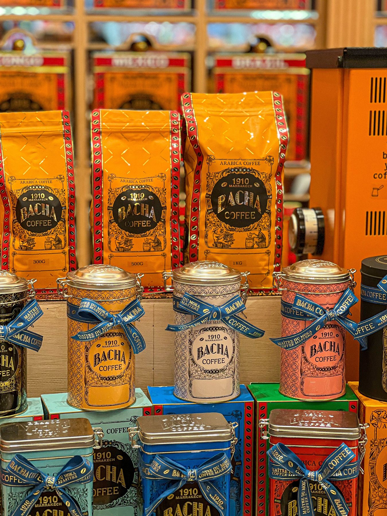
One range, twelve variants, no visual shouting
Build a family resemblance that helps customers choose, rather than making every pack look interchangeable.
Decide what stays still
A range needs a stable framework: perhaps the brand position, product-name area and information panel. These repeated elements help the customer understand that the products belong together. Once the framework is clear, variation can carry useful meaning.
Begin with the smallest and largest formats, plus the longest product name. If the system only works on the most convenient carton, it is not ready for a range. Build the awkward cases into the first design review so they influence the rules rather than becoming exceptions later.
Give variation one primary job
Colour, illustration, numbers and naming can all distinguish products. Choose which cue does the main work. If every element changes at once, the family resemblance weakens; if almost nothing changes, selection becomes difficult.
Write down what each variable means. A colour might identify a flavour, while a number identifies strength. Keep that relationship consistent. Do not reuse the same visual cue for unrelated meanings in different parts of the range. The customer should not need to learn a new code on every shelf.
Test adjacent products
Review packs side by side, not only as individual presentation slides. Put likely neighbours together and look for confusing combinations. Two colours that seem distinct in isolation may become hard to separate when the pack is small or partly obscured.
Repeat the check in a simple online grid. The physical shelf and the digital thumbnail impose different constraints. A secondary word or icon can preserve the distinction when a subtle colour difference is lost. Make sure the cue remains understandable without relying on a legend hidden elsewhere.
Leave room for the next launch
A system built around exactly three colours may become strained when the fourth product arrives. Explore a plausible extension before approving the first range. This does not mean designing imaginary products in detail; it means checking that the rules have room to grow.
Document the spacing and naming behaviour for long text, secondary claims and special editions. Without these rules, each new launch accumulates small exceptions. Over time the range can lose coherence even though every individual change seemed reasonable.
Control special editions
A seasonal pack can be expressive while retaining the elements customers use to identify the product. Decide what can change and what must remain. The answer may differ for a collectible gift box and an everyday refill.
Keep the ordinary product information easy to locate. A striking illustration should not force a customer to search for the actual variant. The strongest special editions feel like a deliberate variation within a recognisable system rather than a temporary abandonment of it.
Make the rules easy to apply
Create a concise range sheet with real examples, including an awkward one. Show the fixed zones, variable elements and approved naming pattern. Give future designers an explanation of why the rules exist so they can adapt intelligently.
A range is a living design system. It should help the next person make a good decision quickly. When the framework does that, new products can feel fresh without making the shelf harder to read.
Make it practical
Turn the next idea into a clear brief. Our browser worksheet helps you record the product, journey and handoff.
Open the reading roomKeep reading
A little more to unfold.
Design / Journal
A packaging brief that saves the second meeting
The most useful brief makes the physical job clear before anyone debates a typeface.
Read the story ↗Design / Journal
Small type has a big job on packaging
Give the back panel the same care as the front. It is where a customer goes looking for answers.
Read the story ↗
Design / Journal
Photograph the package people will actually receive
A useful product gallery balances atmosphere with evidence: shape, scale, details and the real finish.
Read the story ↗