Design / The journal
Small type has a big job on packaging
Give the back panel the same care as the front. It is where a customer goes looking for answers.
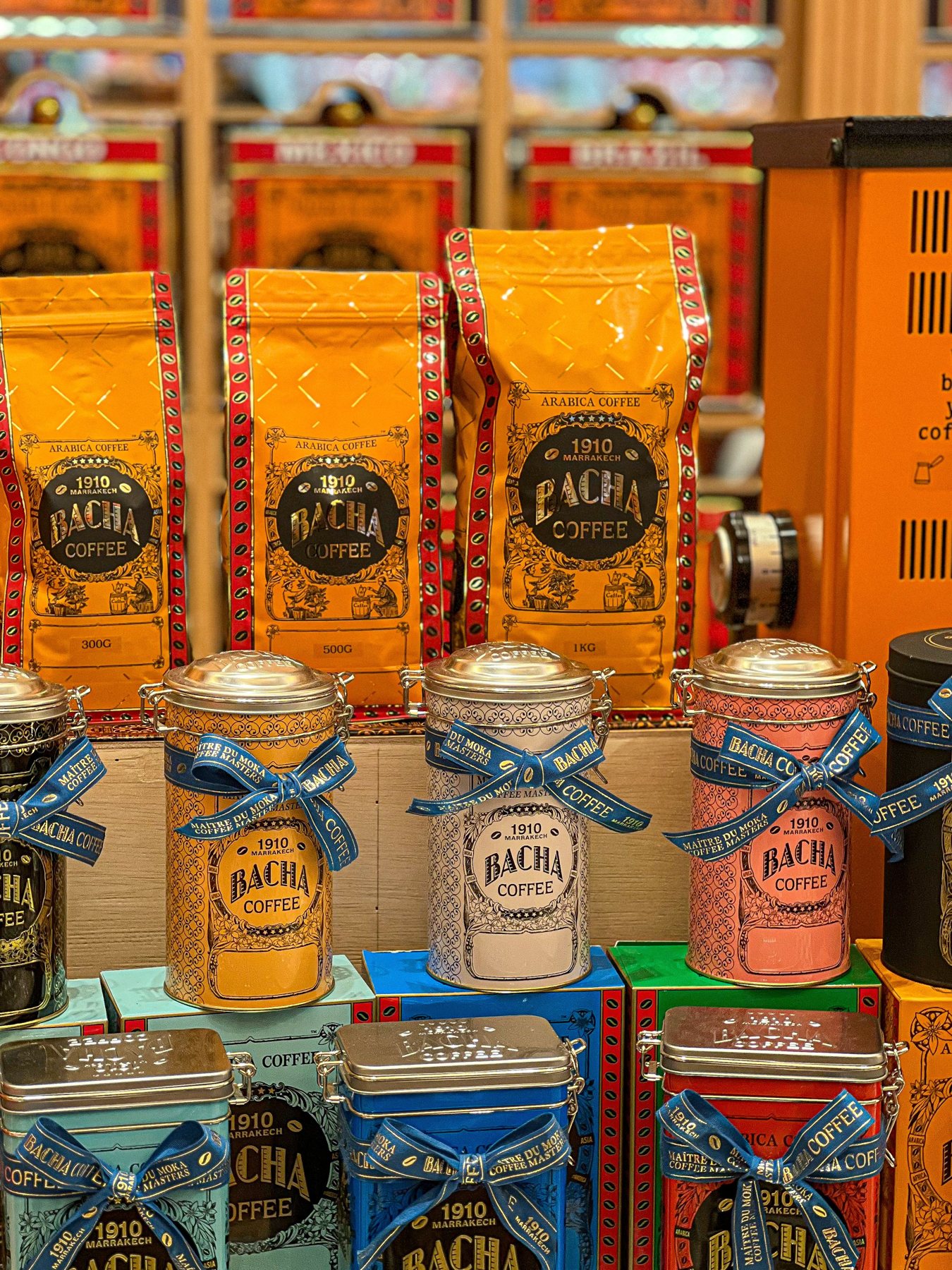
Read the package in order
The front asks for attention. The side and back usually have to explain something. A strong layout recognises that change of pace. Product identity, instructions, ingredients supplied by the brand and contact details should not all compete at the same visual level.
Start by grouping information according to the question it answers. What is this? How do I use it? Which version is it? Where can I learn more? The resulting groups are more helpful than simply making every paragraph the same size and fitting them into the remaining space.
Use real copy from the beginning
Short placeholder copy gives a misleading impression of how much room is available. Put the actual approved words into the layout early, including long product names and the most crowded variant. That variant is often the best stress test for the entire system.
If the text does not fit comfortably, reconsider the hierarchy and available panels before shrinking everything. A small reduction in a decorative element can create much more useful reading space. Ask the responsible business owner to resolve duplication or unclear wording; do not quietly remove required information to improve the composition.
Look at printed size
A back panel that looks spacious at two hundred per cent on a monitor may be tiring in the hand. Print a true-size draft and wrap or fold it around a representative object. Read it without zooming. Then ask someone unfamiliar with the product to find a particular detail.
Pay attention to line length and spacing as well as type size. A narrow column with crowded lines can be difficult even when the characters are technically large enough. A modestly wider text area may help more than choosing a different font. Production requirements should be checked with the relevant supplier and product-information owner.
Protect the awkward areas
Curves, seams and folds interrupt reading. Keep essential words away from a label overlap and avoid placing a paragraph across two faces just because it fits on the flat artwork. A flexible pouch may crease through an area that looked generous on screen.
Create a map of the reliable reading zones. Put the most frequently consulted details in the best zone and leave less critical material for secondary areas. Where the pack shape forces a compromise, test the actual filled package rather than a perfectly flat printout.
Let contrast do some work
Thin pale type can look refined in a close-up and disappear at normal distance. Evaluate text against the actual material, especially where a transparent label allows the product colour to show through. Gloss and metallic surfaces introduce reflections that a flat preview cannot fully explain.
A restrained typographic palette is usually easier to manage across a range. Choose a few roles and repeat them consistently: product identifier, section label, body copy and small reference detail. This creates a rhythm that helps customers find information on the next product they buy.
Review it as an interface
Ask a reader to find the opening instruction, distinguish two variants and locate the batch area. Watch where they hesitate. Do not explain the design before the test; the package will have to work without the designer standing beside it.
Record the confusing moments and fix the hierarchy first. The result may be less dramatic than a new illustration, but it can make the package feel substantially better made. Small type earns its place by helping someone do something.
Make it practical
Turn the next idea into a clear brief. Our browser worksheet helps you record the product, journey and handoff.
Open the reading roomKeep reading
A little more to unfold.
Design / Journal
A packaging brief that saves the second meeting
The most useful brief makes the physical job clear before anyone debates a typeface.
Read the story ↗
Design / Journal
Photograph the package people will actually receive
A useful product gallery balances atmosphere with evidence: shape, scale, details and the real finish.
Read the story ↗Design / Journal
One range, twelve variants, no visual shouting
Build a family resemblance that helps customers choose, rather than making every pack look interchangeable.
Read the story ↗